Original Post
Replies sorted oldest to newest
Former Member
Sorry, I repeat my request. I am really happy with myDMX software which works perfectly for my use and purpose for Party events up to 300 people. My question now is whether it is possible to change text colour or even skin from white to black as it is really difficult to read the text in the blue user mode buttons during the show (white text on blue buttons), when all lights are off and only PC Screen is on. Regards from Germany and thanks for help!
there is no way to do that in my dmx. sorry.
sincerely,
sincerely,
Studio42 (Guest)
Gawd. Skins discussion. Don't people have something better to do with their time?
Make a corporate logo, set it as your background/desktop. Much more efficient and productive.
Make a corporate logo, set it as your background/desktop. Much more efficient and productive.
Former Member
I think he's referring to MyDMX, not his desktop. I will agree with the original poster that it IS not easy to read the blue buttons in the user tab and I also wish the color were something different. Or at least bold the font on the buttons.
Studio42 (Guest)
I know he's talking about MyDMX and not the desktop.
It takes a lot of useless code to bulk up and make unstable an application. Then assuming you inject a viral-ridden graphic for your skin, well, then you're asking for major disasters.
MOST laptops have a dimmer/brightness adjustment for their screens. Turn it DOWN. Then your pupils won't get blown out during events. I turn mine all the way off on my MacBook Pro at events and it's easily readable.
Former Member
Regardless, brightness down or up, the buttons are hard to read - as someone who does lights in a club with MyDMX, I can tell you it's NOT user friendly.
As a developer for a large retailer by day, I can say it would not take a "lot" of "useless code" to at least let someone bold the font for easier reading.
As a developer for a large retailer by day, I can say it would not take a "lot" of "useless code" to at least let someone bold the font for easier reading.
Studio42 (Guest)
I have no problem reading it. Bright or dark. Backlight on or dim.
If you're a developer for a large retailer, then you're not writing software. Maybe if you're a software company....
Try organizing. That is the major time saver. Saves me lots of time.
If you're a developer for a large retailer, then you're not writing software. Maybe if you're a software company....
Try organizing. That is the major time saver. Saves me lots of time.
Former Member
I am interested to hear how many others have a problem with the User Mode Button color. I find it very difficult to see the titles on the buttons when I am DJ'ing events.
I do know there has been discussion about ADJ not adding additional features to mydmx in the future. However, if there are enough people out there that would like to see this minor change to the software, perhaps ADJ will consider an update.
I do know there has been discussion about ADJ not adding additional features to mydmx in the future. However, if there are enough people out there that would like to see this minor change to the software, perhaps ADJ will consider an update.
Perhaps. But we will see. But please no one get their hopes up. I hate disappointing you all but in the end it is not my call.
Jwill Welcome to the forums.
Sincerely,
Jwill Welcome to the forums.
Sincerely,
Studio42 (Guest)
I've clearly stated I am having issues with the buttons in user mode.
I'd rather see some other things get fixed, but I'd also like to see them take a stab at addressing the issue, even if it is a nicotine/renett/alcohol/snail fueled "no".
This is clearly NOT a feature addition, but rather a human user interface enhancement. I'm being careful in my "wish list" to make sure we're not adding some new feature to MyDMX, but rather addressing some shortcomings in what is currently there.
Making Jingles out to be the fall guy in case things don't happen is not an enviable position. We have to understand that he's doing end-user SUPPORT, not R&D or developer support. Don't shoot the messenger.
Thanks chris. I understand the color theme is a reasonable request. I will see what I can do.
Sincerely,
Sincerely,
Studio42 (Guest)
I'd say let's focus on some of the other issues first UNLESS this is a relatively quick fix type of item.
I wouldn't mind having to choose the color on a scene by scene basis IF I didn't have so many scenes. But at least if I had to, I could take my time and do this offline. It's not so annoying when I'm having to make NEW scenes.
That's one thing I'm looking forward to. I got 2 guys I work with now and I'm sure they'll have some input as to new scene ideas. Plus, I've given them the MyDMX software and my stage and show, so they can see what I'm doing. Only thing I'm worried about is importing their data, but I'll figure that stuff out at a later time. I want their designs into my main show. That will be a task for next month as August appears to be getting busy.
Former Member
Hello mydmx forum contributors-
Any update on the possibility of adding a skin feature to the MYdmx ?
Any update on the possibility of adding a skin feature to the MYdmx ?
No. Do you know how often we would update the software? Like maybe twice a year. I have brought this up with the people in charge. I will let you know once i know anything.
Sincerely,
Sincerely,
Former Member
I'm in full agreement with jwill00 -- an alternate color scheme would be greatly helpful. White on black, dark color scheme. It's WAY too difficult to read in a dark environment. Seems like a very, very easy addition, regardless of the ADJ/myDMX policy of no more upgrades...
---------------
Bill Vogel
(313) 586-4500
---------------
Bill Vogel
(313) 586-4500
Former Member
Gotta agree with the other guys on here. Light and dark screens aren't that hard to do and make a world of difference on one's eyes.
This is the Hog with 'Normal' background:
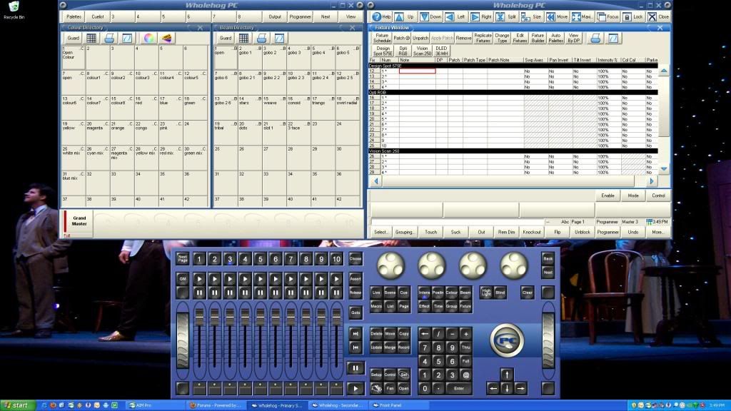
I use this background only for outdoor stuff. Too bright for me otherwise.
This is the Hog with 'Dark' background:
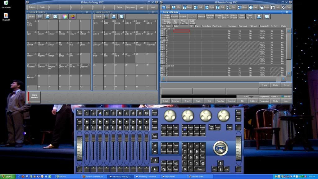
This is the background I use pretty much all the time. Its not hard on my eyes and doesn't light up dark spaces with screen light. As can be seen, the difference is leaps and bounds and your eye will thank you.
This is the Hog with 'Normal' background:
I use this background only for outdoor stuff. Too bright for me otherwise.
This is the Hog with 'Dark' background:
This is the background I use pretty much all the time. Its not hard on my eyes and doesn't light up dark spaces with screen light. As can be seen, the difference is leaps and bounds and your eye will thank you.
Studio42 (Guest)
Had to use MyDMX in a dark room under pressure, over the weekend, and the choice of colors definately needs to be re-thought.
The environment wasn't the best due to pressure. What caused pressure? Previous event started late due to them being unprepared and only listening to me and not my crew. I was elsewhere and cold not get involved. So, then their event runs long and I have to run a pair of secondary events, so I can't set up lights in the background behind the curtain. At any rate, we had sound, we got it the audio for the event running on time and within 5 minutes, lights were finished. I just had to finish programing light addresses so they would be where I needed them to be, and then get MyDMX running. But once the music started, we had to go "dark" in the room, which made the situation difficult. Thanks to the help who helped do those last cable runs.
I did turn down the backlighting, which helped, since MacBooks tend to have bright screens. But overall, the white text on the semi-light blue. Just not a good combination. I think larger buttons and larger text on the buttons(or a bold) is a must have. Something like a Chicago-type font would be ideal. It's plain and easy to read and THICK.
Check out how I typically set things up for shows:

This is fairly typical of how I run MyDMX, although I only have the 3D Visualizer because I'm testing stuff, but it's not unusual for me to leave it runing. I do so during the SacHorrorFilmFest so I can really test my stuff out as I get time to play during breaks. You can see I've never really finished my entire stage design, but it's not absolutely necessary.
I think this is really one of those things where when you don't test in the real world, you can't appreciate it. I did take notice of it this time because it was tough to read at this last event and it bothered me.
We know I'm not the only one affected by this. Maybe not everyone has a problem with this. I have plenty of ideas on various approaches to handling this, some of which involve compromises to the end user(us), but would still be better.
What is good is that it appears that the developers are listening to what we as users have to say. We as users also have to accept limitations to the platform because they simply CAN NOT give us everything we all want at an affordable price that has been provided.
The environment wasn't the best due to pressure. What caused pressure? Previous event started late due to them being unprepared and only listening to me and not my crew. I was elsewhere and cold not get involved. So, then their event runs long and I have to run a pair of secondary events, so I can't set up lights in the background behind the curtain. At any rate, we had sound, we got it the audio for the event running on time and within 5 minutes, lights were finished. I just had to finish programing light addresses so they would be where I needed them to be, and then get MyDMX running. But once the music started, we had to go "dark" in the room, which made the situation difficult. Thanks to the help who helped do those last cable runs.
I did turn down the backlighting, which helped, since MacBooks tend to have bright screens. But overall, the white text on the semi-light blue. Just not a good combination. I think larger buttons and larger text on the buttons(or a bold) is a must have. Something like a Chicago-type font would be ideal. It's plain and easy to read and THICK.
Check out how I typically set things up for shows:
This is fairly typical of how I run MyDMX, although I only have the 3D Visualizer because I'm testing stuff, but it's not unusual for me to leave it runing. I do so during the SacHorrorFilmFest so I can really test my stuff out as I get time to play during breaks. You can see I've never really finished my entire stage design, but it's not absolutely necessary.
I think this is really one of those things where when you don't test in the real world, you can't appreciate it. I did take notice of it this time because it was tough to read at this last event and it bothered me.
We know I'm not the only one affected by this. Maybe not everyone has a problem with this. I have plenty of ideas on various approaches to handling this, some of which involve compromises to the end user(us), but would still be better.
What is good is that it appears that the developers are listening to what we as users have to say. We as users also have to accept limitations to the platform because they simply CAN NOT give us everything we all want at an affordable price that has been provided.
Former Member
I'm glad to see this is a forum topic.
I'd like to chime in and agree that the layouts are a bit tough to read.
The USER mode active scene button is acceptable to read. The inactive buttons are very difficult for this "older" light operator/programmer's eyes.
I'd be happy with all the buttons looking the same as the current active buttons do.
(dark blue)
Perhaps the active button could be a different color or grayed.
The previously posted screenshots of Hog in both "Normal" and "Dark" mode are both appealing to me.
I'd also like to see a more definitive highlight when a particular scene is selected in EDIT mode. I sometimes can't see clearly which scene is selected in EDIT mode.
(especially on a laptop)
As for skins, I could care less.
Thanks for the opportunity to give my 2 cents.
Regards,
Bob
http://www.thesacredclown.com
Add Reply
Sign In To Reply